


I've had my Etsy shop open for a few years now, and over time it's picked up speed and grown little by little. It's by no means a "big" thing, I sell a handful of items a month, maybe a few more in the winter. The whole thing started as a receptacle for all the stuff I made that I didn't have room or use for when I was in college. But now it's definitely become something I truly love and I'm proud of. Maybe it's because of the way my shop started-- more or less as a hobby-- but I've always felt a little naive about my shop as a business. That's why I never really worried about my photos being stolen or not getting the proper source when posted somewhere else. But I've gotten a handful of messages about my images being used on different sites without credit, and I started to get a little concerned. That's why I decided to start watermarking my product photos. I wanted to make an image that was noticeable enough and that wouldn't be easy to crop out if one was so inclined. I'm still a little unsure about how the watermark looks, so I was hoping you guys would give me your opinions!
This is the first image I used it in...
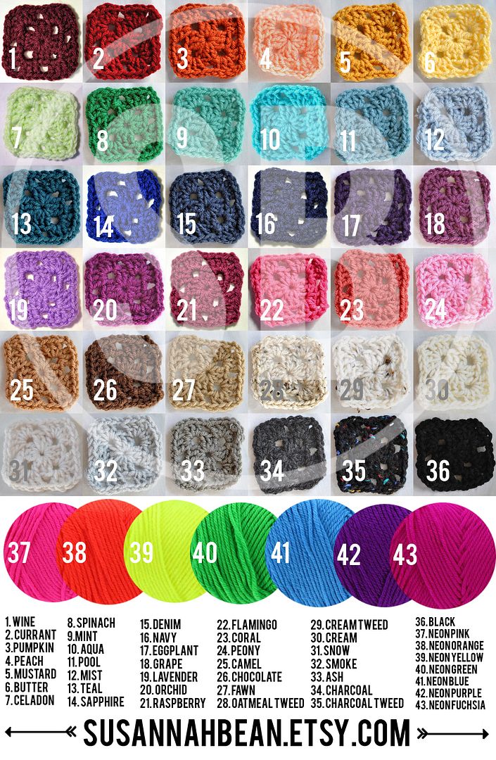 I made a new color card since I added a few more options (numbers 1, 7, 14, 16, 19, and 21). I made the big "SB" image to use, and I slapped a huge one in the background. The watermark is at 50% opacity. I'm pretty confident in this one, I don't feel like I need to edit it anymore. My main concern is that perhaps some of the colors are too hard to see with the thicker parts of the letters on top of them.
 Next I started putting a similar watermark that included my link on my product photos...
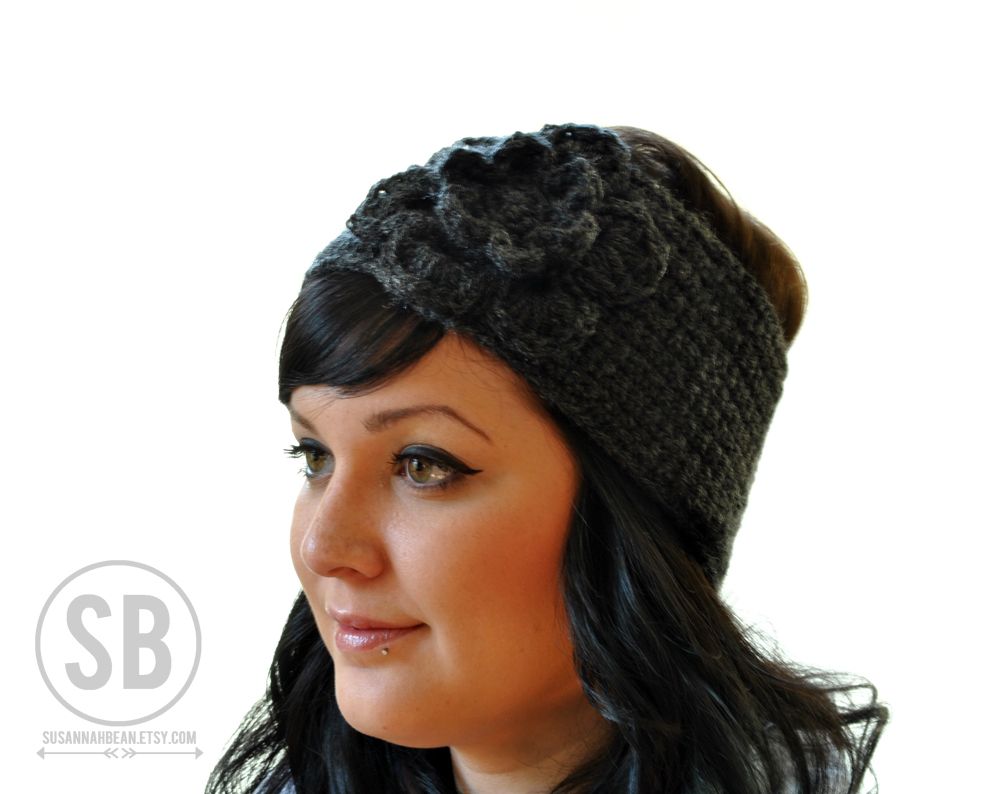
 I did a few sets of photos like the example above, but then I started to feel like the watermark was way too huge. I put this image on Instagram asking for feedback, and a lot of people loved it. A lot of other people said that it was too big and too opaque. I'm definitely in agreement now.
Next I tried reducing the size and opacity...
 I think this looks better that the example above, but I'm still not 100% sold.
 I also made a gray version for photos with white backgrounds...
 I realize this one wouldn't be too hard to crop out, but I would much rather use this than paste a white one over my face or the product.
All in all, I think I like the smaller/less opaque version I came up with, but the problem is I'm still not totally into the idea of having a watermark on all of my images. I like the idea of it, but I don't completely love how it looks. When you look at my shop's home page, some of the item's thumbnail photo shows the watermark. I feel like maybe it's too distracting? I can't quite put into words why I'm still indecisive about it... Anyway, here's where you come in! As a customer, do you find watermarks distracting/annoying/off-putting? If you're a seller, do/would you use watermarks? I'd love to see an example of yours if you do, please leave me a link in the comments so I can check out how other people use them. What do you think of my design? Would it be better to leave off the circled SB and just have the link and arrows?
I really appreciate any and all opinions and information you guys can give me! Thank you :)

The way I see it, if someone really wants the watermark taken out, they will figure out a way to get it out of there. The smaller ones are easily cropped out in the spots that you currently have them, and the larger on (over the color choices) does cover up some of the colors and/or distorts them so that you're not seeing the true color. However, in that respect, I don't know how you would go about "fixing" that.... :)
ReplyDeletei think you're right about the smaller ones potentially being cropped out but... who would do that? i think the smaller ones are more pleasing to the eye and serve as a brand mark rather than a THIS BELONGS TO ME mark. x
ReplyDeleteThe best one is the first one. I know you probably don't like it but putting the watermark in a corner, just makes it easy for someone to crop it. Good luck!
ReplyDeleteWhen I'm perusing etsy, the watermark actually helps my brain remember who's shop I'm looking at/want to order from. Does that make sense? I like having that reminder in my face. Also, if I ever want to see more of a color/a different photo w/o the watermark, I send the seller a message. I like all of the watermarks you're sharing (not helpful? sorry!). The important thing is that the product is quality, which I know yours is!
ReplyDeletexoxo
what about doing a background with your logo on? either in photoshop or doing product photos infront of background with your name/logo all over it?
ReplyDeleteI'm surprised you don't sell alot more! i love your shop.
I think the big logo./watermark looks good too! it's not meant to be a photo for a piece of art its meant to be a product photo and having your name big promotes your brand! :)
ps sorry people were nicking your photos, that's so frustrating!
Barnicles xx
I think the watermark is a great idea. Too many people just run through google images and take whatever. And it can be nice with how many images have lost sources on pinterest!
ReplyDeleteI really think the product photo watermarks are great (both large and small logo versions). However, I would definitely have the outer circle of the watermark at least 'touching' you or the product just a bit. That overlap will discourage a lot of people from going through the effort to edit it out when they could just steal an easier image somewhere else.
As for the swatches, I think that's a little too bold - especially the colors under the 'B'. In this image it is important that people can see the colors, so I feel like the watermark is working against that goal.
Maybe try a few smaller watermarks? I don't think anyone would steal just half of the images, with the white numbers already on them.
Possibly use a few of your arrows throughout and then a smaller 'SB' logo somewhere?
I have gone back and forth on the whole watermarking issue. Even wrote a tutorial on my blog on how to put one on your pictures. But I get lazy, especially if I'm editing several pictures at a time. As a customer, I don't mind seeing them. I like your design but maybe minus the circle and bring the SB closer to the URL.
ReplyDeleteThe first one does what you want it to do but it does obscure the photo and make the colors hard to see. Although easier to crop out I think the middle (or third) option is my favorite.
ReplyDeleteI think for the photos modelling your product, you should keep watermarks on.. but the first one maybe not? Just so people could see the colors clearly. I'm not a fan of watermarks myself and go through periods of not using it.
ReplyDeleteI see it as a problem when people steal your photos and make some sort of profit out of advertising. Then watermarks come in!
You can also go in and edit the metadata of the photos, by going into File-> file info and add your copyright information. That little info gets embedded invisibly and carried around with the image and can help you deter people from using it.
ReplyDeleteCan you remove the background of the colour swatch image and darken your watermark, to be placed in the background, behind the colours? As is should be fine, there is at least a little bit of each colour untouched by it, but it might be something to consider.
I am glad your shop has grown and I am glad that it is turning more into a business then a hobby. I just started an Etsy shop and it is definitely just a hobby. But it is so much fun. ps. I am your newest follower.
ReplyDeleteCarlee
Almost Endearing
I like the second one the best because it doesn't distract from the product, but it makes it clear that it is your product. This will prevent any confusion as to what the source is.
ReplyDeleteI really love the design of it though!
<3
I LOOOOVE watermarks! And this is from a non-seller. If I find a great image on Pinterest/We Heart It/etc, I love being able to find the original source, but sometimes it's just such a pain! Watermarks do all the work for me, and I love that. <3
ReplyDeleteHaving said that, I like the bigger, more opaque one better. Not sure why (maybe because it's easier to read?) but I just do. ;)
Watermarks are great. Do it. It seems odd at first but really you never know who is going to steal what image. Especially if it's on some seethy site. Watermarks are also good because it gets your brand into peoples heads. I think all the ones you posted look great.
ReplyDelete